HISTORY OF THE SUBWAY TILES
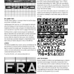
Long before Helvetica became the defacto typeface of the New York City subway system, riders were guided by a mixture of elaborate tile mosaics, enamel, and hand painted signage. Squire J. Vickers, the subway’s lead architect from 1908 to 1942, was responsible for designing the stations of the city owned IND system. Along with the privately owned IRT and BMT, the three eventually merged to become today’s New York City Subway.
It was under Vickers that stations adopted the now ubiquitous and modular black tile lettering. Each black tile contains a single white letter which are combined to create station names and directional exit signs.

NYC SUBWAY FONTS
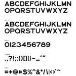
This NYC Subway Typeface is a homage to these tiles and the design era of Vickers and the IND stations.
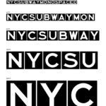
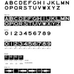
The Monospaced font stays very true to the original tiles with each letter form taking up the same horizontal and vertical space. Also included are directional arrows and superscript ordinals which allow you to replicate most any of the black tile signage of the Vickers era.
The Medium font is a slight variation designed for legibility and balance. Some letterforms are made wider or narrower and rounded letterforms extend slighty above and below the cap height and baseline. While the original tiles had no punctuation, the Medium font includes basic punctuation designed to remain faithful to the hand crafted, yet mechanically precise nature of the IND tiles.

PURCHASE THE FONTS
PREVIEW THE USER’S GUIDE
ABOUT THE NYC SUBWAY PROJECT
Brandon Sugiyama is an Emmy award-winning, California born, and Brooklyn-based art director and motion graphic designer. Shortly after moving to New York in 2011, he fell in love with the subway tile lettering of his local C line.
The NYC Subway Typeface began as a personal project to bring to life a historic piece of New York city daily life. These fonts and designs are an opportunity to share his love of New York with the community and all who visit the greatest city in the world.


